Traffic but no leads? Your website is breaking a promise.
The numbers look fine and the inbox is empty. It isn't a traffic problem. One of seven things is going wrong between the click and the enquiry — find yours, and fix it this week.
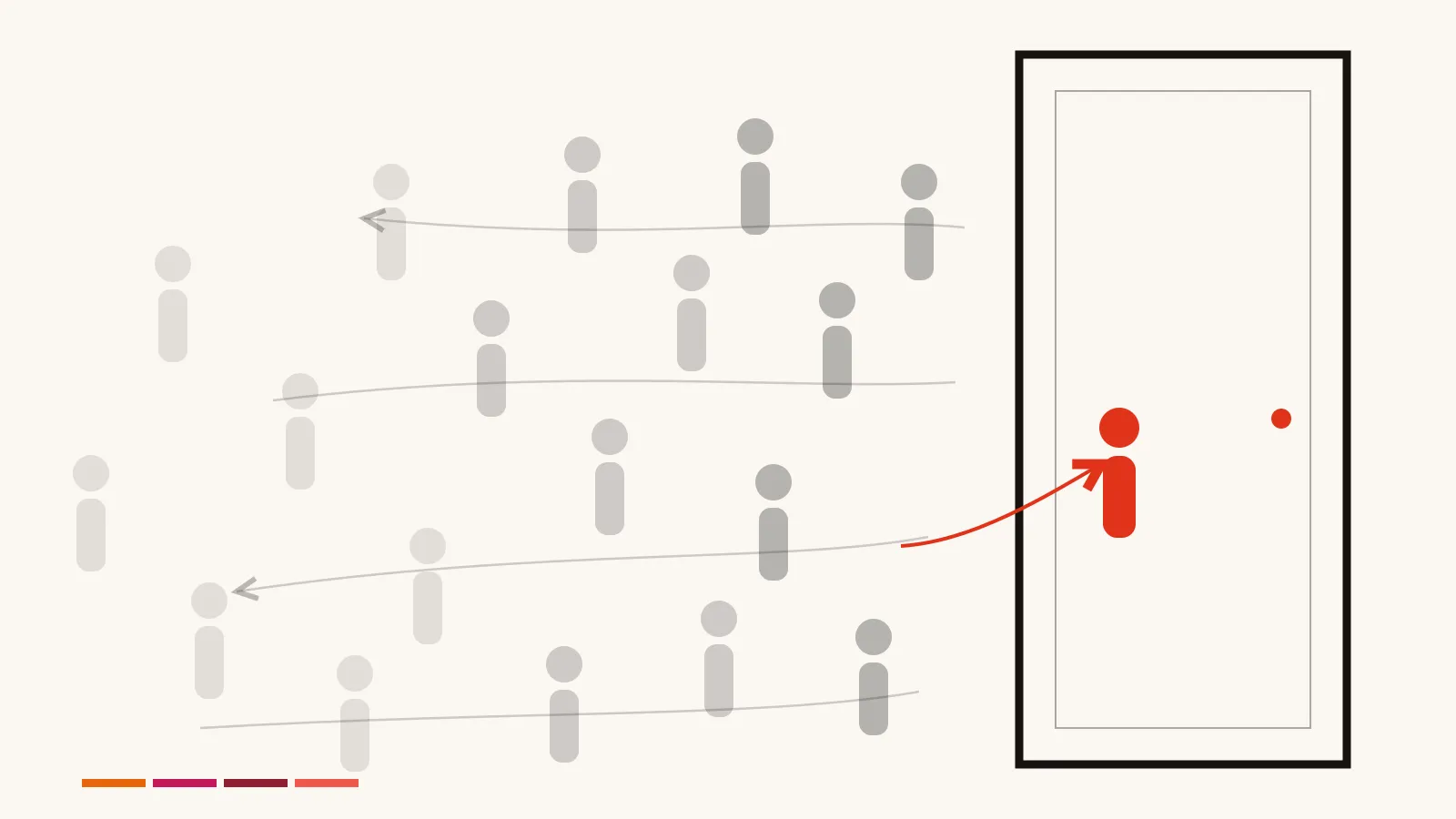
You check the analytics. The numbers look fine. People are finding you.
Then you check your inbox, and it's empty. Again.
So here's the question worth a lot of money: where do they all go?
They don't vanish. Every one of those visitors made a decision — to leave, to keep scrolling, to close the tab, to not press the button — and they made it in a specific place, for a specific reason.
Find that place, and you've found the difference between a website that costs you money and one that pays for itself.
Should I just go and get more traffic?
No — it's the most expensive way to fix this, and it doesn't fix it. If one visitor in a hundred contacts you, doubling your traffic buys you one extra conversation. Fixing the page so three in a hundred contact you buys two — from the visitors you already paid for. Same month, no extra spend.
Your instinct right now is to go and get more visitors. More SEO. More posts. Maybe some ads. Resist it.
Do the arithmetic. Say a hundred people land on your site this month, and one gets in touch.
Double your traffic: 200 visitors → 2 enquiries. You just paid for a hundred extra strangers to buy yourself one extra conversation.
Fix the page so three in a hundred get in touch: 100 visitors → 3 enquiries. No extra spend. Nobody new had to find you.
You already paid to get those hundred people here. Ninety-nine walked away, and you'll never know their names.
The leak is worth far more than the tap.
So what is actually going wrong?
Somewhere between the click and your inbox, one specific thing is failing — and it's nearly always one of seven. The visitor was wrong, the page didn't answer them, they couldn't find their question, they didn't believe you, they couldn't act, the form defeated them, or nobody replied. Every one is fixable this week.
Most take an afternoon. None of them is a redesign.
One word, used throughout: an enquiry is any moment a stranger starts a conversation with you — a call, a form, an email, a DM. Whatever that looks like in your business, it's the only number that counts here.
This article walks the same path your visitor walks, and stops at each of the seven places people give up:
| # | The step | What goes wrong |
|---|---|---|
| 1 | Are these even the right people? | Sometimes your visitors were never going to contact anyone. |
| 2 | They landed. Do they stay? | Most leave in seconds, for one predictable reason. |
| 3 | Can one site answer everyone? | The objection that stops most founders cold. |
| 4 | Do they believe you? | Why good businesses look untrustworthy online. |
| 5 | Can they act? | The convinced visitor with nowhere to click. |
| 6 | Will they finish your form? | Every field costs you people. |
| 7 | Did you answer them? | The leak nobody believes until they see the number. |
Find yours. Fix that one. Ignore the rest for now.
1. Are these even the right people?
You can see exactly what people typed into Google before they landed on you. That one list settles it. If people are arriving on buying words — your service, your city, "cost," "near me" — and still not getting in touch, the page is what's failing them. If they're arriving to learn something, no page was ever going to turn them into an enquiry. It takes ten minutes. Open Google Search Console, and sort those searches into two piles.
Shoppers — about to spend money. "Emergency plumber Marrickville." "Employment lawyer Sydney cost." "Fractional CFO for startups." These people have a wallet out.
Readers — doing research. "What is SEO." "Free logo ideas." "How to unclog a drain." They came to learn something, not to hire someone. No page on earth was getting an enquiry out of them today.
Check this before anything else. Because if your visitors are mostly readers, then people leaving without contacting you isn't a leak — it's the correct outcome. You'd be rebuilding a shop for people who only came in to use the toilet.
Do this today
Look at your top 20 searches. Tick the ones that sound like someone ready to buy.
Mostly ticks? Good — the right people are arriving. So something on the page is losing them, and it's one of the next six things. Keep reading.
Barely any ticks? Then your website isn't the problem. You're attracting people who came to learn, not to hire — and getting the right people to arrive is a different job entirely. That's the Growth desk. No amount of rebuilding will fix it.
2. They landed. Do they stay?
Most visitors leave within seconds, and almost always for the same reason: the page didn't answer the question that brought them there. They typed something specific into Google. Your page replied with a slogan. So they assumed they were in the wrong place and hit back — before reading a single sentence.
First, a thing most people get wrong:
Your visitors mostly never see your homepage.
Google doesn't send people to your front page. It sends them to whichever page it thinks answers their question — a service page, an article, sometimes a page you'd forgotten existed.
So every page on your site is a front door. And each one has a few seconds to prove it.
Watch a door fail
It's 9pm. Someone's switchboard just went bang. They type "emergency electrician Newcastle" and click your link.
❌ BEFORE "Powering possibility. Solutions for modern living."
They don't want possibility. Their house is dark and their kids are frightened. They want a suburb, a phone number, and the word tonight.
Back button. Next result. That one said it.
✅ AFTER "Emergency electrician, Newcastle & Lake Macquarie. On call tonight. ☎ 0400 000 000."
Same business. Same visitor. Only one of them gets the job.
They decide faster than they can read
Researchers have sat people in front of web pages and timed how long it takes them to form an opinion.
The answer comes back in milliseconds — less time than a blink.
Nobody is reading your page before they judge it. There isn't time.
They're glancing, and asking one question: is this the thing I was looking for?
So whichever page they land on has exactly one job in those first seconds. Not to impress anyone. To say what you do, who it's for, and what to do next — in the same words the visitor just typed.
| ❌ Before | ✅ After | |
|---|---|---|
| Accountant | "Beyond the numbers. Empowering your financial future." | "Tax and books for tradies. Fixed monthly fee. No surprises at BAS time." |
| Employment lawyer | "Trusted counsel for a complex world." | "Unfair dismissal claims, Sydney. First conversation free. Most matters resolved without court." |
| Management consultant | "We unlock transformational value for our partners." | "I fix broken operations in businesses doing $5–50m. Six-week diagnostic. You keep the playbook." |
Read the left column and tell me what those businesses cost, who they're for, or what to do next. You can't.
Now the right column. Every one says what, who, next — and quietly kills a fear on the way past. "No surprises." "First conversation free." "You keep the playbook." Each answers something the reader was already worried about, before they could ask it.
Yes, the right column is plainer. But clever is what got you here.
When a line needs explaining, it has failed.
The five-second test
Here's why you can't check your own page: you already know the answer. You wrote the words. Your brain fills every gap automatically, and you cannot switch that off.
So do this instead.
Ask someone who's never seen your site. But don't say "what do you think?" — they'll be kind, they'll say it looks nice, and you'll have learned nothing.
A real visitor doesn't arrive with an open mind. They arrive with a question already in their head — the one they just typed into Google. So put that question in your tester's head first:
"You've just Googled 'employment lawyer Sydney cost.' You clicked the top result. Here's what came up."
Show them the page for five seconds. Take it away. Then ask one question, and only this one:
"Did that page answer you?"
Not did you like it. Not what would you change. Did it answer the question they walked in with — yes or no.
Nobody around? Do it yourself — but arrive the way they arrive. Go to Google, type the search your visitors use, and click through to your own page. Never type your address in directly; that's arriving as the owner. Screenshot the page the instant it loads, then judge only the screenshot — on the live page your eye drifts to the parts you're proud of.
Then do exactly the same to your three competitors. Four screenshots, same search, side by side.
Your page always looks fine on its own. It never looks fine beside the one that answered. And that comparison is what your visitor actually sees — not your page, but your page as one of four choices.
3. Can one site answer everyone's question?
Not on one page, and you should stop trying. Give each question its own page instead. Your homepage answers one question only — "am I in the right place?" — and every other question your buyers type gets a page of its own. One per service. One per real question. That isn't extra work; that's what a website is.
This is the objection that stops most founders:
"People search a hundred different things. I can't fit all that on my homepage."
Right. Don't. Nobody's asking you to — and as we just saw, most visitors never land there anyway.
Watch a broker fix it
Here's what her visitors are typing:
- "mortgage broker Penrith"
- "can I get a home loan as a sole trader"
- "how much deposit do I need for an investment property"
- "refinance or stay fixed"
❌ BEFORE — one homepage, catching all four at once "Your trusted partner on the home ownership journey. Loans. Refinancing. Investment. First homes. Talk to us today!"
It half-answers everything, so it fully answers nothing. The sole trader doesn't see herself in it. Neither does the refinancer. They all bounce equally.
✅ AFTER — four pages, each answering one question properly
The homepage: "Mortgage broker in Penrith. I find loans the banks don't advertise." Its only job is to send people to the right place.
A page for sole-trader loans, opening with the sole trader's exact question, in her words.
A page for refinancing. Same again, for the refinancer.
An article: "How much deposit do you actually need?" It catches the person searching at 11pm and warms them up.
Four ways in, instead of one. Every search now lands on something that replies — and nothing had to be crammed onto the front.
It works exactly the same for a consultancy with four services, or a firm with four practice areas. One question, one page, answered properly. Think of it as a house with several doors, rather than one very crowded hallway.
The takeaway
Write down the five questions people ask you most often on the phone.
Those are your next five pages — and not one of them belongs on your homepage.
4. They found the answer. Do they believe you?
Now they have to trust you enough to hand over their name, and that feels risky. So they scan for two things: proof that real humans are behind this, and a clue about who they'd actually be dealing with. Most business websites answer neither — they offer stock photos and the word "we," and neither earns a thing.
That's not a matter of taste.
Usability researchers at Nielsen Norman Group have spent two decades tracking where people's eyes actually move across a web page. The finding never changes: photos of real people and real work get studied closely, while generic feel-good images are skipped entirely. The eye slides past them the way it slides past an ad.
So the handshake-and-laptop photo isn't neutral. It's invisible — and it's sitting exactly where a real face should be.
The same "About" section, twice
❌ BEFORE "Our team of dedicated professionals brings over 20 years of combined experience delivering quality outcomes for our valued clients."
Twenty-two words. Zero information. No name, no face, no client, no outcome. You could paste it onto any business in any country — which is exactly how it reads. Like it's hiding something.
✅ AFTER "I'm Sam. For 14 years I've fixed operations in mid-sized manufacturers. That's the Newcastle plant in the photo — we cut their order turnaround from nine days to four. Call me and you get me, not a graduate."
Same length. Completely different feeling. A name. A place. A number you could check. A promise about who actually does the work.
The first is a brochure. The second is a person.
Only one of them gets an enquiry.
"But I'm not a one-person business"
Good — because this was never about size.
The problem was never being a team. The problem is being anonymous.
Every buyer asks the same question, whether you're one person or fifty: who will I actually be dealing with?
A big firm that answers it beats a big firm that hides. A solo consultant hiding behind "we" loses to a five-person agency that puts five faces on the page.
So answer it, at whatever size you are:
| If you're… | Say this |
|---|---|
| One person | Say so — and make it the offer. "You get me, not a graduate." That's the one thing a large firm cannot promise. Hiding it throws away your only real advantage. |
| A team | Say who. Not "our team of dedicated professionals" — that's a wall, not a door. Name the person who'd run this client's work. Face beside the name. "Priya will run your matter. She's done 200 of these. She'll call you back the same day." |
| Either | Show real work, with real specifics. The Newcastle plant. Nine days to four. Last month. |
"We" is only a problem when it's a place to hide. Used honestly — real names, real faces, real work — a team is more reassuring than a lone founder, because the client can see who picks up the phone when you're on holiday.
Do this week
Delete the stock photos. Nobody is looking at them anyway.
In their place: the face and name of whoever the client will actually deal with — and one piece of work you finished this month.
5. They believe you. Can they act?
This is the cruellest leak of all: someone is convinced, ready, looking for a way to contact you — and there's nothing on their screen. If your only "Get in touch" sits in the top menu and the footer, then the person who decided halfway down the page has to go hunting for you. Most won't bother.
Think about where the deciding actually happens.
It isn't at the top. Nobody's convinced at the top. It happens right after they read the thing that landed — the price, the proof, the case that looked like theirs.
And at that exact moment, most sites offer them more scrolling.
Not one button per page. A button wherever belief happens.
Now picture where they're sitting
It's 9pm. They're on a phone, one-handed, on the couch. Your "Contact" link is a few pixels tall, in a menu they'd have to zoom in to hit.
That isn't a call to action. It's a test of manual dexterity.
On a phone, the next step should always be a thumb-reach away — a big obvious button, or, if a phone call suits your business, a number that dials on a tap.
Do this today — five minutes, and it gives you evidence, not an opinion
1. Open your site on your phone and read down the page as though you were the customer.
2. Every time you pass something that could genuinely convince someone — a price, a piece of proof, a job that looks like theirs, a testimonial — stop right there and screenshot it.
3. Now look at the screenshots you took.
In how many of them can a stranger contact you, right there, without scrolling anywhere?
Hardly any? That's your leak. You spent the whole page convincing them — and then made them go and find you.
6. Will they finish your form?
Only if it's short. Every field is a small tax the visitor pays in patience, and they run out long before you do. Ask for three things: their name, one way to reach them, and what they need. Delete the rest. Anything else you want to know, you can ask in your reply — when they're already talking to you.
Look at these two forms the way a stranger would.
❌ BEFORE First name. Last name. Email. Phone. Company. Website. Budget (dropdown). Timeline (dropdown). How did you hear about us? Message. "Submit."
Ten fields. That's not a doorway — it's a job application.
And each one quietly asks the same question — are you sure? — over and over, until somewhere around the budget dropdown they decide they're not.
They only wanted to ask you something. You made them sit an exam.
✅ AFTER Name. Email or phone — whichever suits. What do you need? "Send — I reply the same day."
Three fields and a promise.
You still get their budget. You get it in the conversation, from someone already talking to you — not from a gate they were trying to climb.
What one box cost Expedia
Their booking form had an optional field marked "Company name." People misread it, typed the wrong thing into it, and their payments quietly failed.
Expedia deleted the box.
That single deletion is reported to have been worth around twelve million dollars a year. One box. Nothing else changed.
Now go and count the boxes on your form.
Do this today
Cut your form to three fields.
When someone says "but we need to know their budget" — you will. In the reply.
7. They hit Send. Did you answer?
Probably too slowly. The moment someone submits your form is the hottest their interest will ever be, and it cools by the hour. They didn't only fill in yours — they filled in three. Whoever replies first usually gets the conversation, and then the work. Same-day replies aren't good manners. They're the cheapest advantage you'll ever have.
You won't believe this leak until you see the number.
A team at RevenueHero ran an experiment. They filled in the contact form on 1,000 different companies' websites — real enquiries, real "please get in touch" — then waited to see who wrote back.
635 never replied.
Not slowly. Not badly. Never.
Nearly two in every three businesses paid for a website. Paid to get found. Got a stranger to raise a hand and say "I want to give you money" —
— and then said nothing at all.
Most of the ones who did reply took more than a day. By which point the visitor had already spoken to someone else.
So the competitor beating you may not have a better site. Or better prices. Or a better track record.
They might just be awake.
The auto-reply that helps — and the one that hurts
Set up an automatic email, so that nobody who contacts you is ever met with silence. But be careful what it says, because most auto-replies make things worse.
❌ "Thank you for your enquiry. A member of our team will be in touch within 3–5 business days."
That tells a hot lead they've become a ticket in a queue. They'll go and talk to someone else while they wait.
✅ "Got it — this landed with me, not a black hole. I'll come back to you before 5pm today."
One rule governs the whole thing:
An auto-reply exists to say when a human will answer. Then a human has to actually answer.
Give a real time, not a range. Make it a time you can genuinely hit — because a promise you break is worse than no promise at all. You haven't just been slow. You've now proved you're slow, in writing, at the exact moment they were deciding whether to trust you.
(Making all this reliable rather than heroic is what the Automation desk is for.)
Do this today
1. Set up an auto-reply that fires within sixty seconds and names a specific time you'll get back to them. 2. Make it a time you can hit — then hit it. 3. Put the same promise on the form itself: "I reply the same day."
That's it. That one email puts you ahead of most of your industry.
So which one is losing you enquiries?
Find your symptom. Fix that one thing properly. Only then move to the next — one at a time, or you'll never know which change worked.
| What you're seeing | Where you're losing them | The fix |
|---|---|---|
| Everyone's searching "what is…" | 1 — wrong people | Not a broken page. Growth desk problem. |
| Visitors leave in seconds, from every source | 2 — the page they land on | Rewrite the opening: what, who, next. Plain words. |
| Shoppers arrive from search, then vanish | 3 — no page answers their question | One page per question, opening with the answer |
| They read a lot, then leave without acting | 4 or 5 — they don't believe you, or can't act | Real names and faces; a button wherever belief happens |
| They reach the form and don't submit | 6 — the form is a job application | Cut it to three fields |
| Enquiries arrive but go nowhere | 7 — too slow, or silent | Auto-reply in 60 seconds, naming a time. Then hit it. |
Notice what isn't on that list: a redesign.
Almost nobody with this problem needs one. They need five honest sentences at the top of each page, a photo of the human the client will actually deal with, a button where the deciding happens, and a shorter form. Days of work, not months — and you usually don't have to touch the logo.
And it's worth doing. Unbounce studied 464 million visits across 41,000 pages. In every industry, the best pages pulled several times more enquiries than the average one — from the same kind of visitors. Nobody sent them extra traffic. They simply stopped losing the people they already had.
Do this week
Pick the top row that matches you. Just that one. Fix it.
How will I know it worked?
Count conversations, not visitors. Before you change anything, write down last month's enquiries. Fix one thing. Wait two weeks. Count again. Your traffic can stay perfectly flat while your enquiries double — and that's the whole point: same visitors, fewer of them wasted.
You don't need a dashboard for round one. A note on your phone will do:
June — 4 enquiries. → Rewrote the opening line. July — 9 enquiries.
That's the entire measurement system. At the start, it's the only one that matters.
If you want to actually watch people give up, install Microsoft Clarity. It's free — genuinely free, no paid tier — and it records real visitors moving through your site, so you can replay a session and watch where they hesitated, where they scrolled back, and where they left.
Ten minutes watching a stranger fill in three fields, pause at the budget dropdown, and close the tab teaches you more than a month of graphs.
You'll never argue for that dropdown again.
The grown-up version — which page each enquiry came from, and what each one is worth — is what the Signal desk builds. Every site I build ships with one, because "I think it's working" isn't a sentence I'm willing to say to a client.
Do this before anything else
Write down this month's enquiry count.
You can't prove a fix worked if you never knew what broken looked like.
Is there one rule that prevents all seven?
Yes. Before you build any page, write down the one question it exists to answer — and if you can't name that question, don't build the page. Every leak in this article is the same mistake: something on the site had its own agenda, and the visitor's question came second.
Look back at what actually went wrong in each of these.
The slogan that wanted to sound impressive. The homepage that wanted to list everything. The About page that wanted to sound bigger than you are. The form that wanted to qualify them before they'd even said hello. The auto-reply that wanted to sound corporate.
Every single leak is the same mistake, wearing a different coat.
Something on your site had its own agenda — and the visitor's question came second.
So: before you build any page, write down the one question it exists to answer.
Not "the homepage." Not "the About page." The question.
Then build the shortest, plainest thing that answers it. Put a way to reply where they'd want one. And get out of their way.
Your website already did the hard part. It got found.
The rest isn't magic. It's a page that answers the question it was asked, from a human they can see, with a button where they're ready to press it, a form that takes ten seconds — and a reply that arrives today.
Seven fixes. Not one of them is a redesign.
All of them are a build job.
I do this for a living →
— From the Build Desk
Sources: Unbounce, Conversion Benchmark Report (41,000 landing pages, 464M visits, 57M conversions). RevenueHero, B2B lead response field study, 2024 — contact requests submitted to 1,000 companies; 635 received no reply. Nielsen Norman Group, eyetracking research on how people view photos on web pages. Lindgaard et al., Behaviour & Information Technology — first impressions formed in around 50 milliseconds; later studies measured shorter still. Expedia form-field figure as recounted publicly by Expedia's own product team.