Is your dashboard any good? If it didn't change a decision this month, it's decoration.
The test of a dashboard isn't what it shows. It's what it changed. Four objections stand between most owners and that test — here they are, taken in order, each ending on a test you can run on your own dashboard this week.
Open your dashboard. Name the last decision you changed because of what it showed you.
Not a decision it confirmed. A decision it changed — something you'd have done differently, or not at all, if that screen had shown you nothing.
If nothing comes to mind, your dashboard isn't a tool. It's decoration. That's the whole test, and it's the claim this article defends.
Most owners don't accept that test straight away. They push back, and the pushback comes as four objections — almost always in the same order. So that's the shape of this article: each section takes one objection, answers it, and leaves you holding a piece of evidence about your own dashboard. By the end, the question is settled either way.
How do I know if my dashboard is any good?
A dashboard is good if it recently changed a decision: you did something you otherwise wouldn't have, because of a number on it. Metrics displayed, reports generated, hours spent looking — none of that counts. The only unit of value a dashboard produces is a changed decision. No changed decisions, no value.
Two definitions, so we're talking about the same thing for the rest of the piece.
A dashboard is wherever your numbers live. Google Analytics, a Looker screen, a spreadsheet, the Xero reports, the monthly PDF your agency emails you. If you look at it to know how the business is going, it's your dashboard.
A decision is money or time moving. The accounting practice that took on a second bookkeeper. The law firm that rewrote its employment page instead of its homepage. The wholesaler who dropped a product line that a report showed was quietly losing money on freight. Hired, dropped, rewrote, rescheduled, stopped: those are decisions. "Interesting, traffic's up" is not.
With those two definitions fixed, the test needs no judgement at all. You're not asking whether the data is accurate or the charts are clear. You're asking one yes-or-no question: in the last month, did a number on that screen move money or time?
And the move doesn't have to be big. Calling your quietest client segment first this week is a decision. Cutting an hour of admin because a report showed where the hour went is a decision. Rewriting the auto-reply that greets a new enquiry is a decision. The test counts changes of direction, not their size — a dashboard producing small course corrections every month is working harder than one waiting for a reason to be dramatic.
Do this today
Write down the last three decisions you made in the business — anything that moved money or time. Next to each, write where it came from: a number, a conversation, or gut.
That list is your baseline. If none of the three trace back to your dashboard, you now have it in writing.
But don't I need visibility across the whole business?
Visibility is a feeling. A decision is an event. A wall of forty metrics produces the feeling reliably and the event almost never, because it's built for watching rather than acting. The useful question isn't "can I see everything?" — it's "which numbers, if they moved, would make me do something?"
Here's the difference, because it's the hinge of the whole argument. Visibility is what you feel when you close the tab: informed, on top of things, in control. That feeling is real, and it's renewable. You can collect it every Monday for a year while nothing in the business changes. A decision, by contrast, leaves a trace. Money moved or time moved, and a month later you could still point at where it went. The trap of a big dashboard is that it pays you in the feeling, on time, every week. So you stop noticing it never produces the event. You walk away satisfied, and the satisfaction is the cost of the dashboard, not the return.
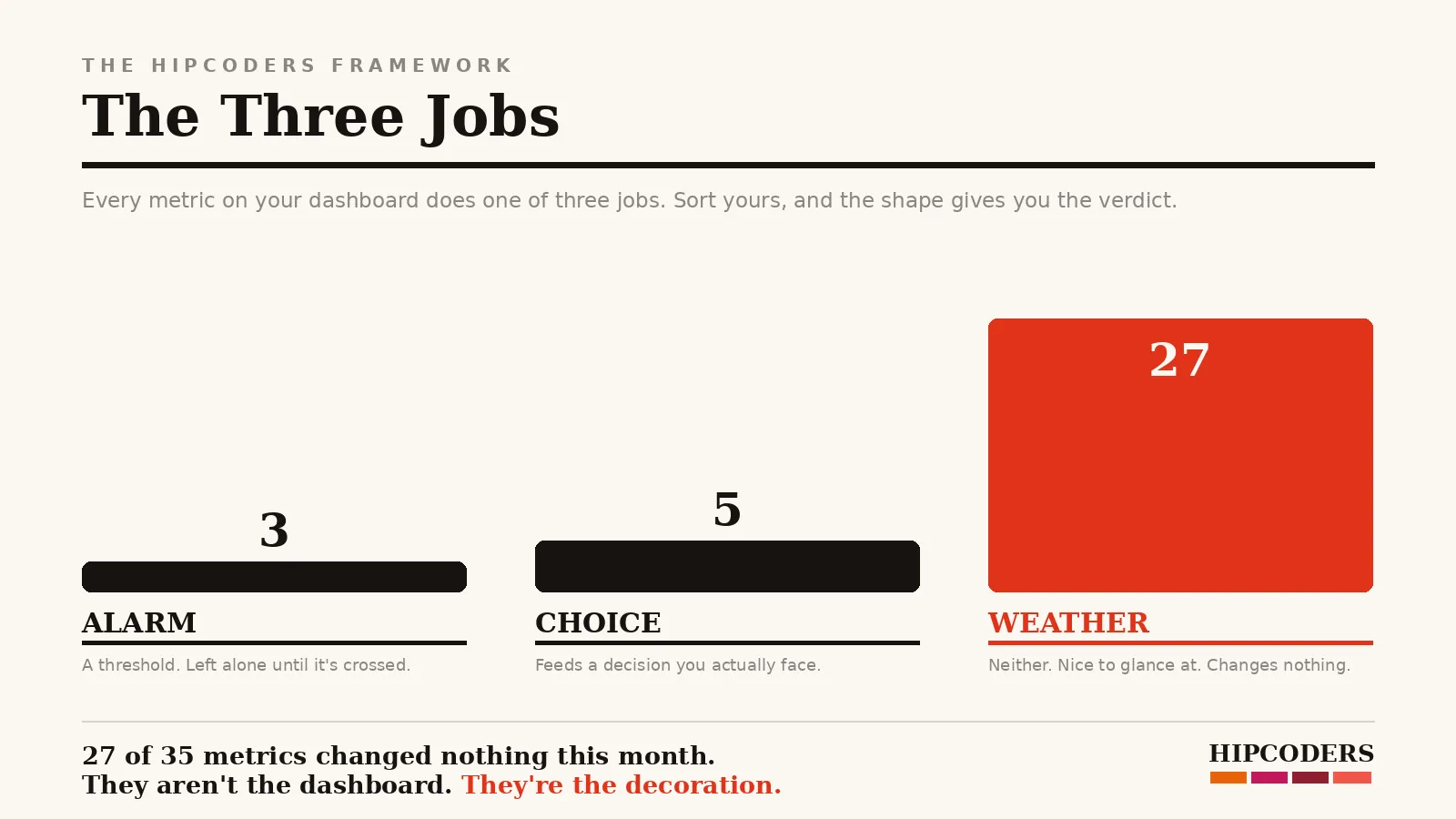
Once you see that split, there are only two legitimate jobs a number can do, and "visibility" isn't either of them.
Job one: the alarm. Some numbers exist to sit quietly until they cross a line. Bank balance below a floor. Reply time above a day. Site down. These matter. But you don't watch an alarm. You set a threshold and let it interrupt you: a message when the balance drops below the floor, a flag when an enquiry sits unanswered past a day. If you have to remember to look, it isn't an alarm. It's a chore wearing an alarm's job title.
Job two: the choice. Some numbers exist to settle a decision you already know is coming. Which service earns the next page on the site. Whether the second hire pays for itself. Whether to renew the directory listing that claims to send you work.
Only two? Test the candidates for a third. "Context" numbers — the year-on-year trend, the industry benchmark — either feed a choice you'll actually face, which makes them job two, or they don't, which makes them weather. Numbers you keep because someone else needs them — the bank, the accountant, a business partner — are real obligations, but they live in your accounts and reports, not on the screen you steer by. Every third job I've been offered collapses into one of those. If you find one that genuinely doesn't, that's a metric worth keeping.
Everything else is weather reporting. Pleasant to glance at, changes nothing, and it buries the two kinds of numbers that would.
Do this today
Take your dashboard's metrics and sort every one into three columns: Alarm (it has a threshold and something happens when it's crossed), Choice (it feeds a named decision you actually face), Weather (neither).
Count the weather column. That number is how much of your dashboard is decoration — and now it's a count, not an impression.
Which numbers actually earn a place on the dashboard?
A metric earns its place when you can complete this sentence about it: "If this number crosses X, I will do Y." A threshold and an action, written down. Any metric that can't complete the sentence is being collected because it's easy to collect, not because it's needed.
The sentence is the whole admission test, so watch it work on one concrete case.
Take enquiries per week for an electrical contractor. "If enquiries drop below five a week for three weeks, I move a day from the tools to visiting the builders and property managers who used to send work." Threshold, action, owner. It passes — that number has a job.
Now try bounce rate. "If bounce rate rises above… I will…" — will what? For most businesses the sentence has no honest ending, which is the polite way of discovering the metric was weather all along.
Run the survivors from your Choice and Alarm columns through it and you'll usually end up with a shortlist like this:
| Metric | The question it answers | The decision it can trigger |
|---|---|---|
| Enquiries per week | Is work still arriving? | Shift time to outreach, or don't |
| Enquiry → job rate | Are we losing them after they ask? | Fix the follow-up, not the website |
| Source of the last 10 enquiries | What's actually sending work? | Renew, cancel, or double down |
| Reply time to a new enquiry | Are we answering while they're still deciding? | Change who owns the inbox |
| Revenue per job, by type | Which work is worth winning more of? | Aim the next page, quote, or hire |
Five rows. Yours will differ, but not by much — and not by thirty.
Do this today
For each metric that survived the sort, write its if-then sentence in full, with a real number as the threshold. Blanks are verdicts.
The sentences you finish are the specification for the dashboard you should have. Keep the page — it's the rebuild, already designed.
Isn't more data always better for decisions?
No. Past the handful of numbers you act on, every added metric taxes the attention the important ones need. The research everyone cites in defence of "more data" actually measured something narrower: firms that used data to decide outperformed. Nothing in it rewards the size of the dashboard.
Start with the arithmetic of attention. Say you give the dashboard ten minutes a week — generous, for most owners. Forty metrics into six hundred seconds is fifteen seconds per metric. Nobody has ever made a decision in fifteen seconds of glancing. A forty-metric dashboard doesn't give you forty insights a week; it gives you forty skims and no verdicts.
Now the study, used honestly. Researchers at MIT and Penn first clocked this in 2011, and it's been cited ever since: they surveyed 179 large publicly traded firms and found that the ones whose decisions were driven by data outperformed what their size and technology spend predicted. Same inputs, better output — the gap was roughly
5–6% of output and productivity.
Across a year, that's roughly two and a half to three extra weeks of output, from the same people and the same spend. That's the prize, and it's real. But keep the scope welded on: the study measured deciding with data. It says nothing about collecting it, displaying it, or how many charts the winners looked at. The premium goes to the decision, and the decision needs five good numbers more than it needs forty adequate ones.
Do this today
Next time you open the dashboard, start a timer and keep a pen next to you. Write down every number you actually read — read, not scrolled past — before you close the tab.
Timestamps and a list, not memory. That's your true dashboard: the metrics on the paper. Everything else on the screen is load-bearing for nobody.
Why do I look at my dashboard but never act on it?
Because it reports instead of recommends. A page of numbers with no hierarchy hands you the analysis as homework, and homework loses to the inbox every time. Dashboards that get used put one question at the top — what should I do next? — and demote everything else to supporting evidence.
Look at how the typical dashboard is organised: by data source. A traffic block because Analytics exports one, a social block because the scheduler does, a revenue block from accounting. That's the shape of what was easy to collect, not the shape of any decision you face.
So invert it. The top of the page belongs to this month's live decision — one number, its threshold written beside it, from the if-then sentences you drafted two sections ago. Below it, only the evidence that bears on that call. The alarms don't need screen space at all; they need notifications. The weather goes.
And here's the honest branch: if you do all this and find there's genuinely no decision on the table this month — the business is steady, the alarms are quiet — then the right dashboard is a short monthly email, not a live screen. Smaller is a legitimate answer. A dashboard has no minimum size, only a minimum consequence.
Do this today
Put the one if-then metric with the nearest threshold at the top of your dashboard — or, if the tool won't let you, on a sticky note across the top of the screen it lives on. Threshold written next to it.
That note is the prototype of the rebuilt front page: the decision first, the evidence under it.
Is there one rule that keeps a dashboard honest?
One changed decision a month. That's the rent a dashboard pays for your attention. A metric that hasn't moved money or time in ninety days comes off the page; a dashboard that hasn't changed a decision in a month shrinks until it does. The goal was never watching the business. It's steering it.
Notice what the rule is not. It's not "measure what matters" — everything can be argued to matter, which is how the forty-metric wall got built. It's not "check your numbers weekly": you can be diligent about decoration. The rule is the same test the article opened with, now with a clock on it: the dashboard justifies itself in decisions changed, or it justifies itself not at all.
It's also self-enforcing, which is the best property a rule can have. Applied monthly, it either keeps the dashboard small and consequential, or it shrinks the thing to a monthly email and hands you back the ten minutes. Both outcomes are wins. The only losing outcome is the one most dashboards live in now: watched, trusted, and changing nothing.
Do this today
Set a recurring reminder for the first Monday of the month: "What decision did the dashboard change?" Write one sentence in reply, in a running note.
Three blank months in a row is the verdict — and the brief for the rebuild.
Sources
- Brynjolfsson, E., Hitt, L. & Kim, H., Strength in Numbers: How Does Data-Driven Decisionmaking Affect Firm Performance? (MIT / University of Pennsylvania, 2011). Survey of 179 large publicly traded US firms; data-driven decision-making associated with 5–6% higher output and productivity than investments alone would predict. A foundational study, not a recent one — cited here for what it measured (deciding with data), not what it's often stretched to mean (collecting it).